Simplifying the Teacher Experience
Years of accumulated requirements had turned a critical teacher journey into an obstacle course. I aligned competing teams around what teachers actually needed and radically simplified the entire experience.
+65% registration conversion
+33% projects submitted
–50% project-creation time

My role
Product and design leadership, stakeholder alignment, research direction, experience strategy, UX design, and front-end coding
Team
Product management, design, UX research, engineering, operations, marketing, and corporate partnerships
The Challenge
Teachers are the content creators on DonorsChoose. Almost all of the site’s content comes from them and they provide the human element that gets community donors, foundations, and corporate funders to give. Unfortunately, the site experience for teachers was lacking, leading to poor conversion and uninspiring content.
Part 1: Fixing Teacher Registration
The old teacher registration flow made a really poor first impression for our teachers. They were greeted with a high-pressure five-step form that felt like a contract. Then came the terms and conditions screens…two of ’em. Then, a school picker that would test the most dedicated teacher’s resolve. And after that, more checkboxes, inputs, and textareas. Finally, teachers were given a hard stop that kicked them off the site to go confirm their email—before they’d even seen what they were signing up for.
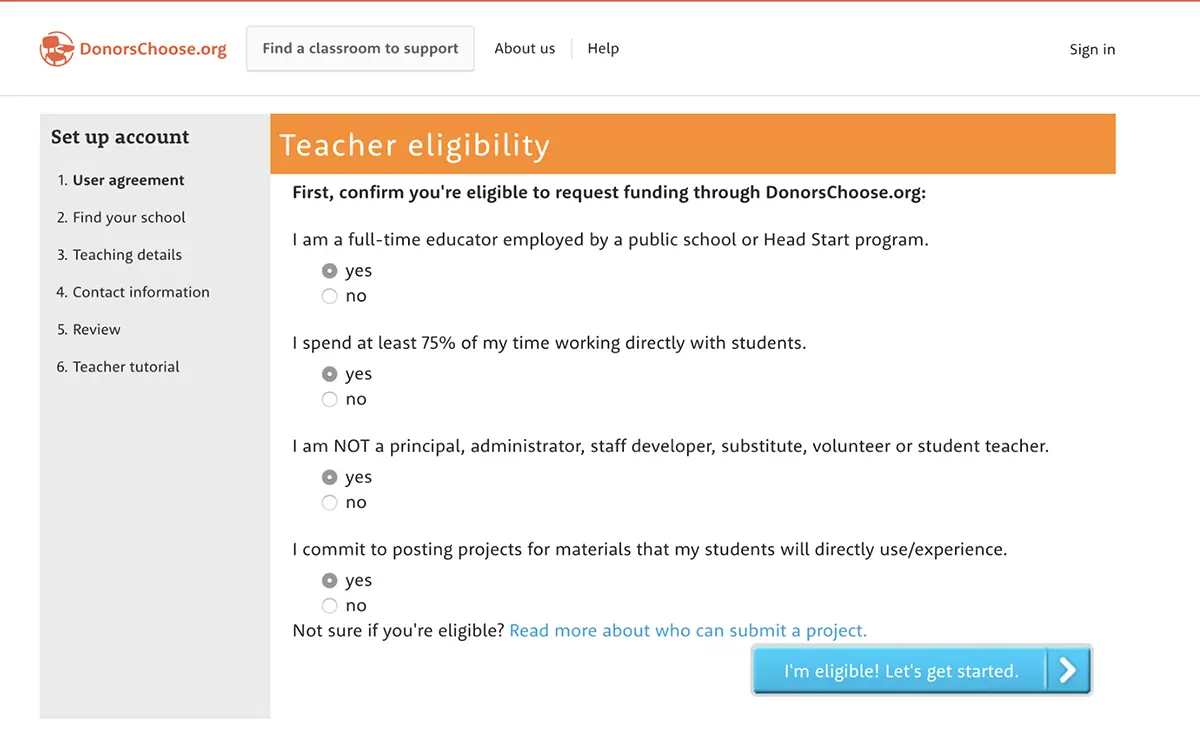
Of the teachers who started the sign-up flow,
only 34% actually made it through.
Rewriting the Rules
We started by asking the obvious question: Do we really need all this? Did we need 20 separate pieces of information before a teacher could even see what DonorsChoose was about?
We challenged every team that said they needed each piece of data that we were collecting and cut it down to just 5. We simplified the design. We front-loaded the email address collection so we could follow up with teachers who didn’t convert. And we got rid of the email verification roadblock, pushing it further down the funnel, when teachers were already invested and motivated. What was left was a dead simple two step sign up flow.
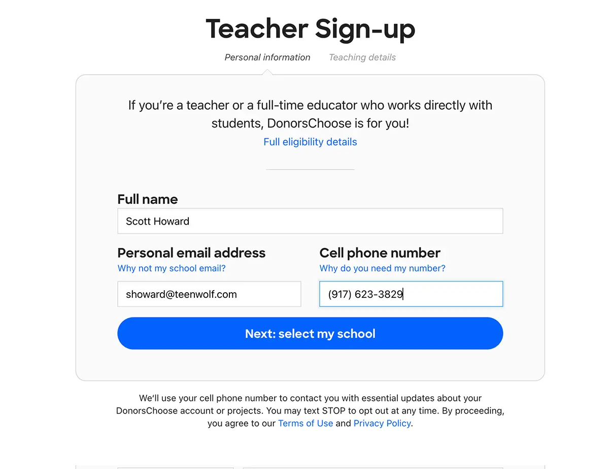
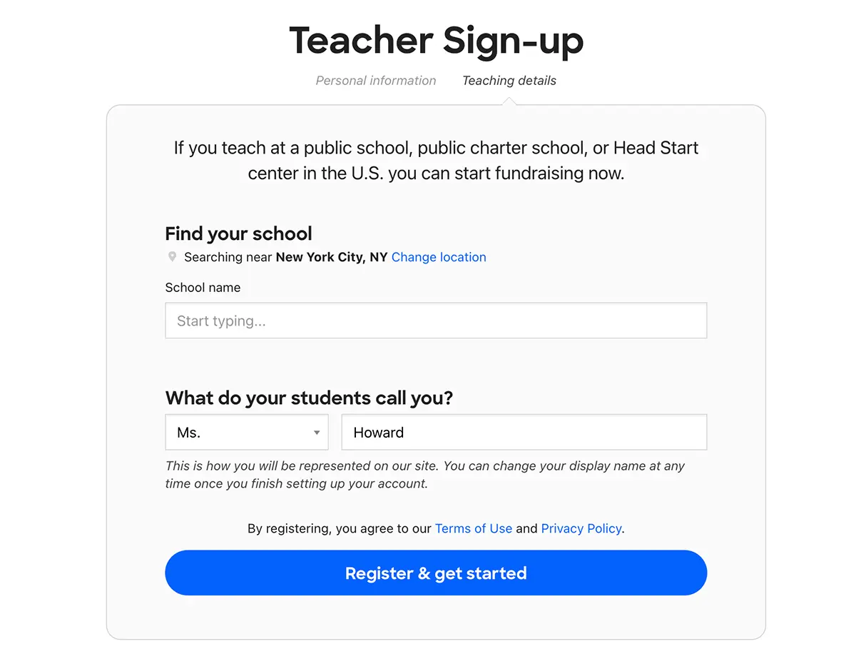
Results
Once we shipped these changes, the numbers validated all of the problems we identified during our initial analysis and research:
- +65% conversion rate. This is the kind of conversion boost product people dream about, but rarely get to deliver. Way more teachers were successfully signing up after the redesign.
- +91% mobile conversion rate. The improvements we made were felt even more on mobile devices, where our teachers had been suffering the most.
- +20% same-day project submissions. By simplifying the experience and building momentum, we saw a big uptick in project posting, which is the ultimate goal of our teacher-facing work.
We turned a “prove yourself first” experience into a welcoming, action-oriented invitation with less friction and more momentum. This streamlined experience paid dividends in the next phase: turning those sign-ups into powerful stories.
Part 2: Rethinking Project Creation
We were asking a lot of our teachers. To create a project on DonorsChoose, teachers needed to provide a photo of their classroom (with a lot of strict requirements!), do quite a bit of creative writing, and go shopping for classroom materials on a series of incredibly hard-to-navigate third-party sites. It was stressful and time consuming for teachers!
The list of problems with the old project creation flow were plentiful, but as we did our research, some major themes emerged:
- Too many steps and too much of a time investment. Between school, lesson prep, and grading, teachers are busy enough. We needed to be more respectful of their time and make the whole process faster.
- Outdated visual design. This experience was a few years old and it was showing its age. The design was out of sync with the visual language used on the rest of the site.
- Writing an essay is scary. Many teachers are not comfortable with writing an appeal for donations and we were asking them to do a whole lot of it, all on one screen.
- No inspiration. New teachers had a hard time understanding what tone to strike or how to approach their project. How could we expect teachers to create compelling content if we don’t show them what it looks like?
- It wasn’t mobile-friendly. Creating long-form content isn’t the best fit for mobile devices, but teachers often create their project over multiple sessions, pausing and restarting whenever they have free time. So the multi-device experience had to be consistent and tight.
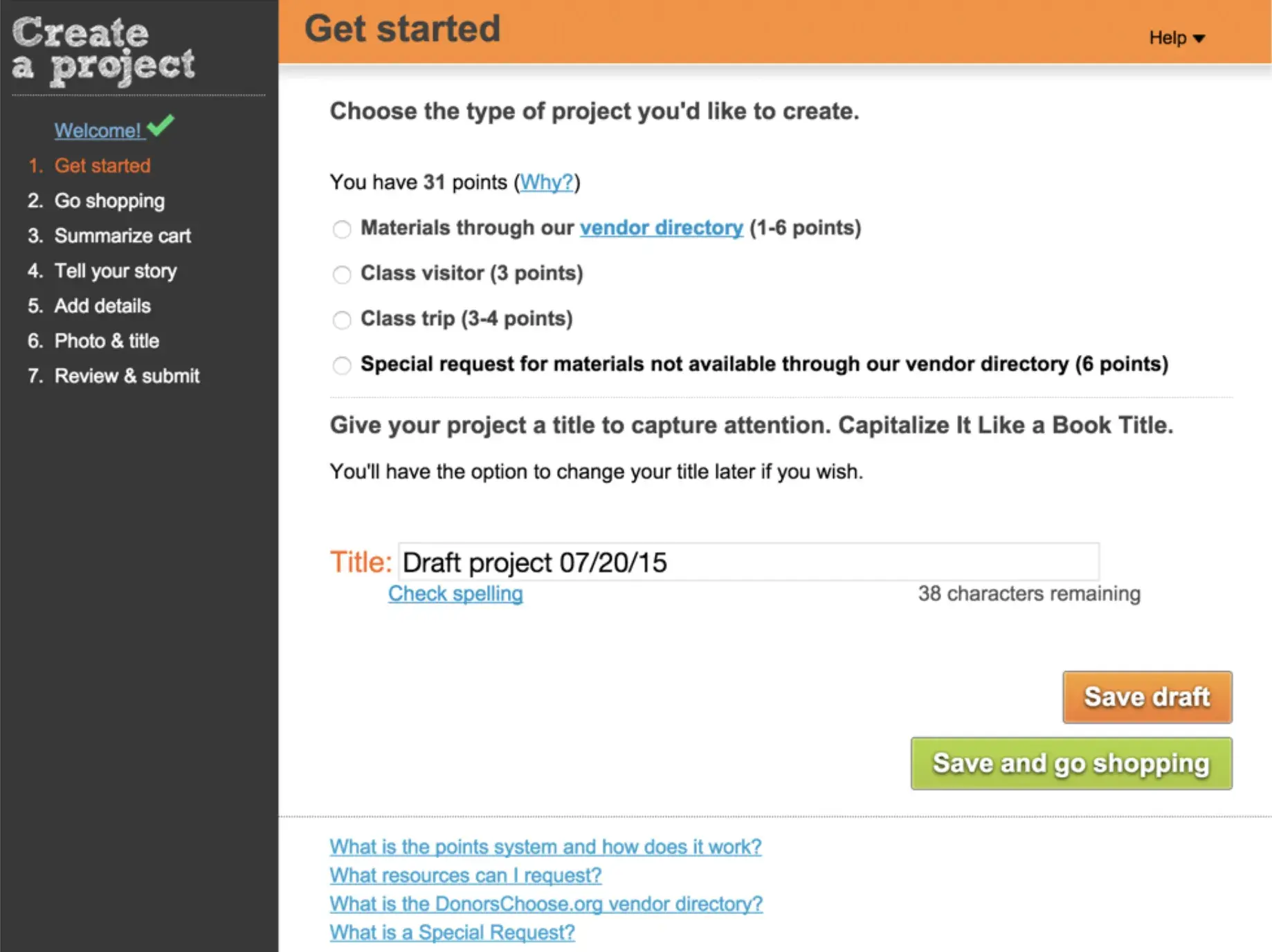
And because of all of this, the number of teachers who actually got through the entire process and posted a project was low: only 49% of teachers who started a project successfully submitted it. We knew we could do better and we owed our teachers a better experience.
Eliminating the Unnecessary
The easiest path through the old project creation flow was thirteen steps (many of the steps in the above screenshot had sub-steps!), and some paths took even more steps. We whittled that down to five total steps and reorganized the pieces of data we were collecting to make everything feel more approachable.
Updated Visual Design
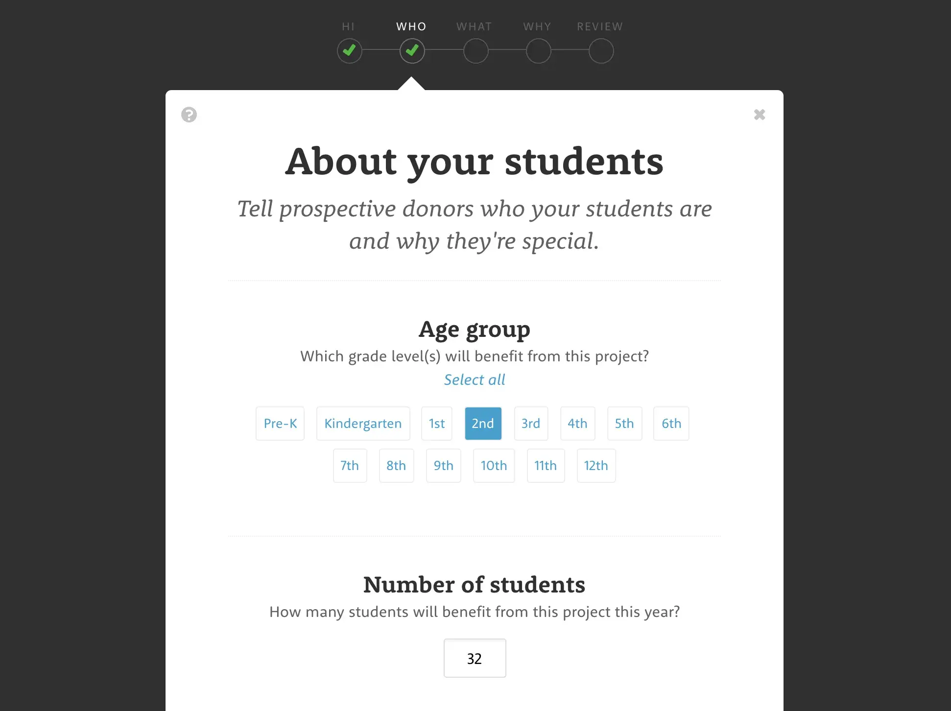
The old visual design had a complex layout with a lot of colors and distractions, which made it difficult to focus on the actual content. With the redesign, we moved to a single-column layout and far fewer colors with a cleaner visual hierarchy and a lot of whitespace. This allows teachers to scroll straight down each screen and focus on one piece of information at a time.
We also used a design technique called tunneling to keep teachers focused in the project creation experience by removing the main site navigation and all the distractions that came with it. This makes the act of creating a project feel like you’re expected to progress through the entire flow in one sitting.
Good Examples & Clear Instructions
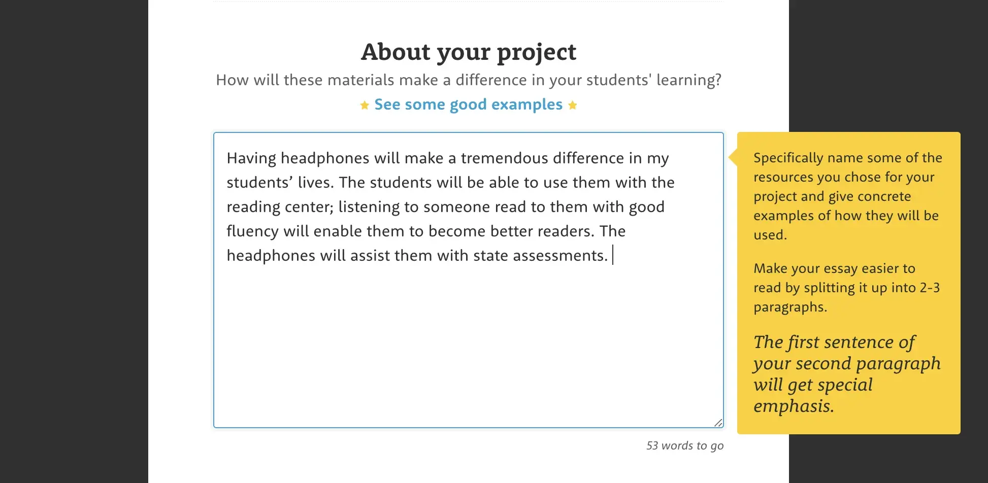
One thing we learned in our early user research was that first-time teachers had no frame of reference for what made a compelling project. To remedy that, we provided relevant good examples for every piece of writing we asked for, hand selected from successful projects from other teachers. We also offered helpful coaching tips and bits of encouragement that we surfaced as the teacher was writing.
Editable Preview Before Submitting
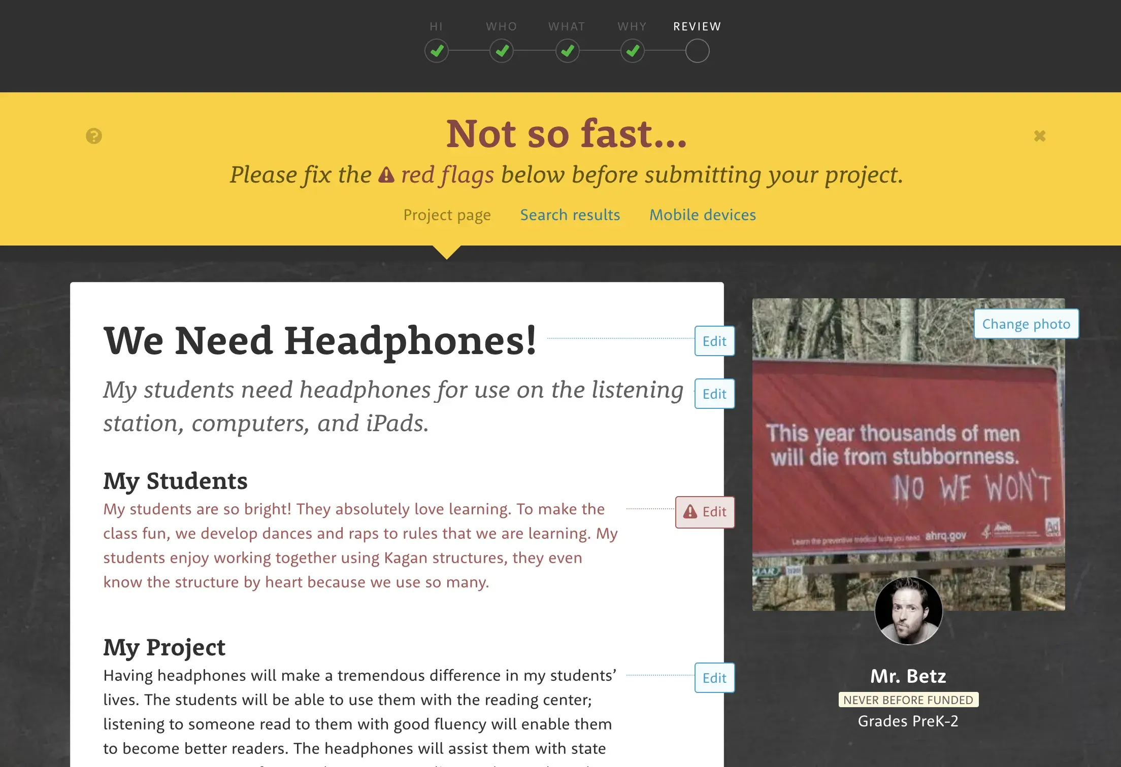
In the old design, editing content was a pain in the horns. In our early research we saw that teachers were frustrated that they had to jump around through the 13-step process to make edits one at a time. With our redesign, in addition to previewing exactly how the project would look on our site, we added the ability to make edits on the final “review your project” step. Additionally, we added validation to this view so we could easily flag fields that needed edits before submitting.
The Results
We put our designs in front of real teachers throughout the redesign so we felt confident in these changes. Here are some of the key metrics we measured:
- +33% conversion rate. We took a 49% conversion rate up to 65% across all devices with the largest improvement showing on mobile.
- -50% time spent. As expected, the fact that there were now far fewer steps worked in our favor. The time spent on every step also sharply decreased, with one exception: the review and submit step. Teachers are now spending more time there, but in a healthy way that leads to better composed projects.
- +23% teacher satisfaction. We measured a System Usability Score to gauge satisfaction of first-time teachers, immediately after submitting their first project (before they get the goods).
This was really heartening and showed that all of the user research we did throughout this project helped us stay on target with a solution that not only moved the right metrics, but gave teachers a more positive experience.
But you don't have to take my word for it...
“I’ve seen Dan devour both quantitative and qualitative user research, roll up his sleeves as a designer who codes, and lead a team to build stellar experiences for donors, teachers, and partners.”
Just the Beginning…
These two redesigns didn’t solve all of our problems, but they had an immediate, outsized impact on the number of teachers entering the DonorsChoose ecosystem and the quality of content they created. We’ve since iterated on these designs and shipped many more improvements that have made the funnel even tighter and the experience better for our teachers.
Next case study:
Great design drives impact
At DonorsChoose, it helped unlock $1B in classroom funding. Want to build together? Reach out.